The color palette for our living spaces will take a delightful turn toward sophistication and vibrant warmth.
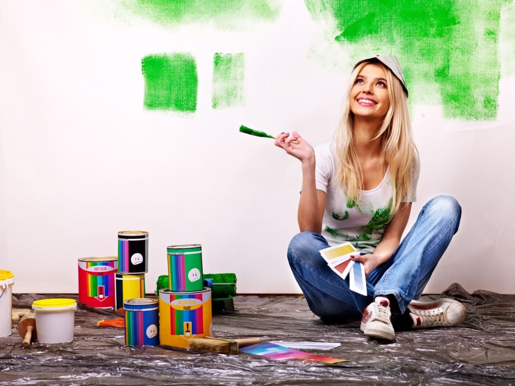
With the ever-evolving trends in interior design, homeowners are eagerly looking for painters who can bring these fresh, trendy colors into their homes.
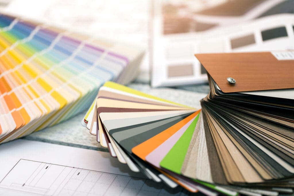
From the serene embrace of earthy tones to the dynamic splash of bold blues, greens, neutrals, and lively yellows and oranges, there’s an endless canvas waiting to transform your space.
Each color selection promises to imbue your home with a unique character and ambiance that reflects your personality and lifestyle.
For a refreshing update, please keep reading to uncover the trendsetting interior paint colors of 2024 and how to incorporate them into your home.
Discover the Top Earthy Tones for a Warm Ambiance
As we venture deeper into the palette of earthy tones, it becomes clear that embodying the essence of nature in our homes creates a sense of tranquility and warmth.
Two standout hues have caught my attention this year for their unique ability to transform spaces.
First, we delve into soft terracotta, a color that brings a grounded yet rich atmosphere to living rooms.
It’s like wrapping your space in the warm embrace of the earth, inviting comfort and conversation.
Next, we explore the integration of olive green into kitchens.
This vibrant shade breathes life into your culinary sanctuary, ensuring every meal feels like a feast amidst nature.
Both colors elevate the aesthetic appeal of your home and enhance its emotional resonance, making these tones perfect candidates for our 2024 refresh.
Exploring Soft Terracotta as a Base for Your Living Room
Choosing soft terracotta for your living room walls adds an unparalleled warmth that transforms the space into a cozy retreat reminiscent of a serene desert at dusk. With its earthy undertones, this hue complements natural wood and leather furniture, infusing the room with a calm, inviting atmosphere. It’s a decision that marries the timeless beauty of the outdoors with the comfort of home, making soft terracotta a trendsetting choice for any homeowner looking to bring a touch of nature’s tranquility indoors.
Integrating Olive Green Into Kitchens for Natural Vibrancy
Embracing olive green in the kitchen adds more than a pop of color; it injects vitality, reflecting the lush outdoors. This verdant shade acts as a bold backdrop, animating the space where families gather and meals come to life. By choosing an olive green for interior painting, you’re not just updating your kitchen’s design; you’re weaving a vibrant thread of nature into the heart of your home, fostering a lively environment that stirs inspiration with every dish prepared.
How to Incorporate Bold Blues in Your Home Office
Shifting the focus to my home office, I’m eager to discuss the dynamic power of bold blues, renowned for their transformative effects on a workspace.
This 2024, incorporating such vibrant hues into the office amplifies its elegance and tailors the atmosphere to foster unparalleled productivity and creativity.
My exploration delves into the sophistication of navy walls paired with minimalist furniture, creating an environment that enhances focus and drive.
Concurrently, I aim to unravel how sky-blue accents can introduce a serene, creativity-boosting ambiance, ultimately marrying productivity with peace.
This color selection journey promises to redefine your workspace, making it a trendsetting beacon of function and inspiration.
Matching Navy Walls With Minimalist Furniture for Focus
Embracing navy blue for my home office walls has been a game-changer: it establishes a profound depth. It offers an unparalleled focus zone, contrasting sharply with the minimalist furniture I prefer. The color’s intensity harbors a sense of serenity yet drives concentration, making the workspace a haven for productivity. This strategic pairing has not only upgraded the look of my home office through interior painting but has also significantly enhanced my work efficiency.
- Selected a navy blue shade that resonates with the room’s natural light, ensuring the space remains inviting and conducive to extended work periods.
- Choose minimalist furniture with clean lines and a neutral palette to maintain focus on tasks without visual clutter distracting from the serene and focused environment I aimed to create.
- Incorporated metallic accents and greenery to inject a subtle vibrancy into the space, balancing the deep navy with elements that keep the atmosphere fresh and lively.
Utilizing Sky Blue Accents to Promote Creativity and Calm
Incorporating sky-blue accents into my home office has been pivotal in sculpting an environment that nurtures creativity and calmness. This light and airy color gives the room an open sky feeling, making it easier to breathe and think. This subtlety of sky blue gently encourages a flow of new ideas while providing a tranquil backdrop that reduces stress during demanding interior painting projects.
Bringing Nature Indoors With Green Hues in 2024
As we enter 2024, infusing our living spaces with the essence of nature continues to reign supreme in interior design.
Embracing green hues marks a bold step in this direction, symbolizing growth, renewal, and balance.
Specifically, transforming bedrooms with the calming presence of sage green offers a sanctum for restful sleep and rejuvenation.
Meanwhile, the bathroom becomes a retreat when adorned in a tapestry of green shades, crafting a spa-like ambiance that invites relaxation and refreshment.
The choice of green embodies the natural world’s aesthetic appeal and enhances our personal spaces’ psychological comfort.
Sage Green Bedrooms for Restful Sleep and Rejuvenation
Opting for sage green in the bedroom has become a transformative decision in my quest for a serene and refreshing sleeping environment. This subtle yet impactful shade captures the essence of nature’s calming energy, delivering a space where peace and tranquility pave the way for deep, rejuvenating sleep. It’s a color choice that beautifies the room and enhances my overall well-being, proving indispensable in achieving the utmost relaxation after a long day.
Layering Different Greens in Bathrooms for a Spa-Like Feel
In pursuit of crafting a sanctuary of relaxation in my bathroom, I’ve found incredible solace in layering various shades of green for interior painting. This palette, ranging from the soothing whispers of mint to the depths of emerald, curates a space that genuinely encapsulates the rejuvenating essence of a spa. Each layer seamlessly blends, fostering an environment where every moment feels like an escape to a verdant retreat, thus revolutionizing how I perceive and experience my oasis.
Embrace the Power of Neutral Paint Colors
As we navigate the eclectic palette of interior design trends for 2024, the understated allure of neutral paint colors emerges as a clear frontrunner in interior painting, proving its timeless relevance in creating sophisticated, serene spaces.
This year, we’re moving beyond the simplicity of mere background colors, diving into the strategic layering and texturing that neutrals can provide.
Perfecting the art of monochrome involves exploring the subtle yet profound impact of varying shades of gray – each offering a different mood and depth to our living environments.
Similarly, the transformative power of interior painting off-whites in brightening and enlarging small spaces effortlessly stands out, demonstrating that the right choice of paint can significantly alter our perception of space and light.
These approaches cater to aesthetic preferences and respond to our sanctuaries’ growing desire for versatility and tranquility.
Perfecting the Art of Monochrome With Varying Shades of Gray
Diving into grays unlocks a spectrum of possibilities, from the softest silver to the deepest charcoal. This approach allows me to craft sophisticated and grounding spaces, utilizing shades of gray for interior painting to bring depth and complexity to each room. It’s a journey of discovering balance where each shade contributes its unique voice, setting the stage for monochrome elegance that radiates modernity and timeless appeal.
Using Off-Whites to Brighten Small Spaces Effortlessly
Turning to off-whites to illuminate small areas has revolutionized how I perceive and utilize compact spaces. These soft hues can reflect light, making rooms feel more extensive and more open without overwhelming them with color. Choosing the right off-white can seamlessly blend walls with the ceiling, creating an illusion of height and space that is both inviting and expansive.
- I selected a palette of off-whites with a subtle undertone to complement the room’s natural and artificial lighting, ensuring the space feels cozy and spacious all day.
- Experimented with different finishes, opting for a matte finish on the walls to diffuse light softly, further enhancing the sense of space.
- Incorporated reflective surfaces and strategic lighting to amplify the effect of the off-white walls, creating an airy ambiance that maximizes the perceived area of the room.
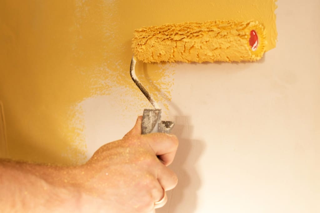
Making a Statement With Vibrant Yellows and Oranges
As we delve into the vibrant heart of the 2024 color trends, it’s impossible to overlook the dynamic duo of yellow and orange, known for bringing energy and warmth into any residential painting space.
In the realm of dining areas, a splash of sunflower yellow not only revitalizes the environment but also stimulates appetites and conversations, turning meals into memorable gatherings.
Meanwhile, the introduction of burnt orange textiles in rooms adorned with neutral tones promises to inject a cozy yet sophisticated contrast, blending seamlessly with understated residential painting backgrounds to create a rich visual experience.
These choices are not just about adding color; they’re strategic moves to infuse your home with a lively spirit and tailored elegance that will stand out in 2024.
Adding Pops of Sunflower Yellow to Energize Dining Areas
Introducing sunflower yellow into my dining area has been transformative. It injects a cheerfulness that elevates every meal into a more joyous occasion. With its robust energy and warmth, this shade perfectly complements natural light flooding in during the day while providing a cozy glow under evening lighting. The decision to incorporate sunflower yellow was inspired by its ability to create a vibrant focal point, fostering lively discussions and making every gathering in the dining area memorable.
Incorporating Burnt Orange Textiles as Contrast in Neutral Rooms
In my journey to infuse my living space with a refreshing blend of warmth and sophistication, introducing burnt orange textiles against neutral-toned interior painting rooms has been a revelation. This bold choice is a striking contrast, enriching the space with depth and character. Burnt orange, with its earthy yet vibrant undertones, harmonizes seamlessly with softer backgrounds, crafting a chic and inviting atmosphere that captivates and comforts in equal measure.
Conclusion
Selecting trendsetting interior paint colors for 2024 is pivotal in transforming homes into spaces that resonate with warmth, creativity, and tranquility.
Soft terracotta and olive green are dynamic choices that bring the natural world indoors, creating inviting and vibrant living spaces.
Venturing into the workspace, bold blues such as navy and sky blue significantly enhance productivity and foster a calm yet creative environment.
Furthermore, embracing green hues, shades of gray, and off-whites reflects a deep appreciation for nature, sophistication, and the clever manipulation of small spaces to appear more expansive and inviting.
Lastly, vibrant yellows and oranges promise to energize and sophisticatedly contrast with neutral tones, ensuring that the chosen palette for 2024 elevates the aesthetic appeal of homes and nurtures the well-being of their inhabitants.

Marc Poulos began his real estate and financial services career, but he soon realized that his true passion was beautifying homes. He started working with various small craftsman shops before serving an apprenticeship with the Ritz Carlton Hotel in Chicago. His commitment to excellence won him Top Apprentice from Washburne trade school in Chicago – the country’s premier school of its kind.